I tried my hand at a new challenge today. Pun intended. Can't say I love the result (mostly because the way I strung it removes all semblance of bone structure and makes it look like a pudgy alien hand), but at least it's kind of interesting to look at. I like the footlite at the top. It's also my first SUCCESSFUL use of betweed! Sooo... that's better than a whack on the nose with a rusty poker.
Two points to you and a chocolate frog if you can tell me where that quote came from. ho ho ho.
Friday, March 30, 2012
Monday, March 26, 2012
weekly Challenge #64: String Theory v. VIII 'Fortuneteller'
The Diva hath thrown down the gauntlet... and here is my first-ever submission to her Weekly Challenge! <insert angels singing here>
The challenge: To use a predetermined string (that's tanglespeak for 'those little pencil lines that separate the different patterns') and find a way to add in/blend together random patterns in such a way that the final result does not suck.
The challenge: To use a predetermined string (that's tanglespeak for 'those little pencil lines that separate the different patterns') and find a way to add in/blend together random patterns in such a way that the final result does not suck.
If you would like to read more information on the Diva's weekly challenges, roll on over to that little button in my sidebar and you'll see one that looks appropriate. I'm not going to tell you which button it is. Think of it as a little sidebar-button scavenger hunt. Now, go! Go forth and discover!
Thursday, March 22, 2012
does this pattern make my Unbatz look big?
I came up with this nifty little pattern after I took my first zentangle class. I call it 'unbatz'. Lots of variations come to mind after step two, but this one is my favorite.
A couple of things to note:
Step 1: Try to keep your COLUMNS lined up. It will matter in step three.
Step 3: Start each figure 8 in the middle of the space so they're relatively symmetrical. If they're too high or too low, your step four will look wonky. And nobody likes a wonky unbatz.
•••••••
•••••••
• ❃ • ❋ • ❁ • ✿ • ✽ • ❀ •
Thanks for stopping by!
Feel free to join me here,
where I frequently share artsy things that inspire me,
invite tanglers to share art,
crack silly jokes,
and offer up the
occasional
tangle
prompt.
:oD
❀
Friday, March 16, 2012
sunny on the inside
Back in December, I was inspired by some painted ceramic suns hanging in a local Mexican restaurant, so I got a few photos so I could play with the idea later on. At that point, I hadn't taken Sandhya's Zentangle class and didn't really know what it was. I just knew I had a thing for color and really intricately detailed ink doodlin'. I also hadn't started playing around with watercolor yet, but Santa knew I wanted to try it. :oD Santa knows everything! Especially if Santa is either your husband or a friend (formerly your boss) who has been around you nearly every day for about a third of your life. Yeah, I'm lookin' at you, Linda!
A few weeks later - Arches cold press watercolor paper, a technical pen, and soot black india ink :o)
For a while, I actually thought about leaving this black and white. I don't know what I was thinking. The color is just so happy. This thing matches every jordan almond* in the box ;o) I framed it today with a pristine white mat but since there is a micron pen in the vicinity I doubt very much that it's going to stay white for very long.
*speaking of, if you ever stop at Buc-ees, go get a bag of their 'no sugar added' jordan almonds. All the yummy and half the sweet. (and thanks to my sister-in-law for cluing me in.)
Tuesday, March 13, 2012
Shrinky Dinks... not just for breakfast anymore.
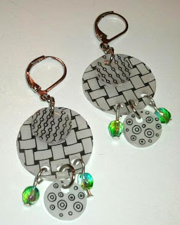
Thought I'd try my hand at making some tangled earrings today. I went a little bonkers at the local craft store and bought several paper punches in different sizes and shapes (they were 40% off... it was like they KNEW), a few different kinds of blank shrinky-dink sheets, and assorted beading supplies. This is one of four different styles I came up with. These were made with the clear sheets/rough finish. I'm going to experiment with colored pencils and opaque white sheets next. As much as I like these, I think they'll be more appealing when I throw in a little color. Also, there will be a bracelet attempt tomorrow. That should be interesting!
Here are a few of my first attempts, though I ended up adding small black glass beads to the jump rings at the top to spruce them up a little. I like these because they're more 'tangled', unlike the ones I posted above with just one pattern per piece. I think I'll try drawing the string on a separate sheet of paper next time and tape the translucent earring material to the paper until I'm finished tangling it. The pencil string is so dark it looks like ink... remember everything's darker after you shrink it!
Thursday, March 08, 2012
CADENT
Cadent study with watercolor. This is a good example of why we use ink instead of pencil... if I had been able to fix my mistake, I never would have discovered the variation on the upper right. Which I love.
Wednesday, March 07, 2012
INDY-RELLA, and all who love her.
Meet indy-rella. I like it because you can vary the shapes quite a bit and get different effects, and you can make it look darker or lighter by tightening up or loosening the strokes in the pattern, so it's pretty versatile when you're thinking about contrast within your tangle. Looks amazing when shaded... not hard to draw behind other things... aaand, it won't steal your wallet or tease the dog. WIN.
Tuesday, March 06, 2012
Lady Rene
Just playing around with one of my favorite fonts, Lady Rene (designed by Sudtipos, a font foundry in Argentina). I wrote in with a glyph question shortly after buying it, and the guy who wrote me back was the one who actually designed the font. :o) I thought that was pretty dang cool.
Sunday, March 04, 2012
zendalas!
 |
You're looking at my first zendala tile. The 21-tile tins haven't been officially released yet, but I got my paws on one at seminar. There are nine different pre-string round tiles (two of each design) and a few blank ones in each tin. They're a little bigger than the square tiles at just over 4.5 inches across.
Although I love the way this looks, it seems a little more like a tangle pattern sampler than freeform artwork because 1) the spaces between the strings are so small and 2) there are a LOT of spaces to fill. Compared to a square tile you'd probably put five or six patterns on at most, this one's got 37. Because it's so structured and the gaps between the strings are so small, I didn't feel compelled to 'color outside the lines' to make it more artsy. They are still beautiful and fun to tangle... but you're definitely not going to get through this one on your lunch break. :o)
I've mailed out twelve blank zendala tiles to some of my fellow tanglers. Once I get photos of all of them I'll post the collage here so you can see how widely varied and utterly amazing they are. One of them is even on its way to the Netherlands! Exciting.
Subscribe to:
Posts (Atom)


