Sunday, April 29, 2012

WUNDERWALL & WUNDERMUTT


I tinkered with a new pattern today! The deconstruction was was easy enough, but it took me forever to figure out how to space out the dots so the end result looked right. Anyway, *here* is the source of my euphoria, from a book of Japanese paper.


Here goes nothin'.


Columns of dots... pretty simple. This is going to be a staggered grid when it grows up, but I'm drawing it in columns becaaaaause...

(you should know that over a dozen index cards and a ridiculous amount of red ink have sacrificed themselves so I could impart this wisdom to you.)

...if you want your final pattern to look like the 'starburst' pattern above, your dots must be much farther apart horizontally than they are vertically. I tried this pattern several times over with similar (terrible) results, before I finally got that. I kept drawing a square grid without even realizing what I was doing wrong *smacks forehead* 

Here's why the spacing is important:


Notice that in both A and B the distance between the rows is the same, but the columns are twice as far apart. 


I promise, once you get this part down, the rest is cake


::2::
In case you're wondering why this part takes two steps, my staggered grids and regular dot grids always start off the same way. For a staggered dot grid, I just draw all of the dots a little further apart and then go back and add the offset dots in between. This method helps to keep everything spaced out evenly. 

That's another cookie trick.

If you don't need/want to use this method, you can ignore it, pass go, collect $200, keep calm and tangle on, go raid the fridge, et cetera.


::3:: 
Told you the rest was easier.


::4:: 
The simplest way to do this part is to draw all the lines going in the same direction, turn your tile, and then do all the lines going in the opposite direction. I didn't actually remember that until after it was finished. 
Zig-zagging works too.

The columns of dots (hey, let's call them power pellets!!) below aren't as spaced out as they should be, but since the red ink and the black ink are both in the right place, I'm gonna call that a win. 


::5::
Draw from the middle of each triangular space to each corner. I go through first and put a dot in the center to anchor my lines (as you can see above) but I freely admit this is probably not necessary. If you do it, make sure it's small enough that a single line will conceal it.

Use slow, deliberate strokes. Try to be precise at the center of each triangle, because there is no good way to conceal mistakes there. Also, try to be precise when attaching your lines to the dots in the grid because there are a lot of lines converging there. If they don't meet at the right spot, it's possible to end up with some distracting white gaps or dark spots in your final pattern. 


The end result:


And as a border:


Now that we've figured out the rules, let's break a few!


with extra dottiness


with some extra outlining here and there


buncha lines as shading.


a moderately successful attempt at Rick's Paradox.


with an oversized dot grid


with double lines.


with a very unobtrusive dot grid.


with wavy lines.


with lots of aura action.


with skinny football shapes replacing the lines in the Y


with skinny football shapes replacing ALL of the lines


•••••••••••••••••••••••••••••••••••••••••••••••••••••••••••••••••••••••••••••••••••••••••••••


I love this variation so much that he gets his own name. 

This is WUNDERMUTT. His parents are WUNDERWALL and N'ZEPPEL. Ooh, I love it when a plan comes together!


The steps are the same as Wunderwall except you draw the 'squished balloons' in the triangles before you add the Ys in the middle. 

Remember the lines in Y stop short and do not continue on to the dot, or the rounding effect is ruined.


Blogger's note: 
If you would like to try a very different approach to drawing a pattern that looks similar to Wunderwall, get your paws on a copy of 'Totally Tangled' by Sandy Steen Bartholomew and check out HEMP. 

If you're comfortable with the method outlined above, get the book anyway. Fifty pages of unique patterns, tips, and ideas... it's one of those books you can't resist flipping through. Repeatedly.


Happy tangling!


Tuesday, April 24, 2012

weekly challenge #67: 'amanda' (earth) day

I don't currently have anyone in my life named Amanda, but if a child (most especially the Diva's child) declares that the earth must be referred to as 'Amanda' (even if he doesn't know one either)... well...

Happy Amanda week!

I'm posting two tiles for earth day: one that I like and one I don't. I'm striving to be more diva-like; it resonated with me when she said tangling is 'more about the process than the product' for her. And drawing a feathery egg was... uh... quite a process. I think I'm gonna need to spend a little more time getting acquainted with the Featherfall pattern before we can really get along.

The second tile I did a while back, but if you wanted it any earthier, you'd have to rub it in the dirt.


Saturday, April 21, 2012

Diva challenge #66- Laura's Auras

The Diva challenge for this week is to use tangle patterns that have auras, or parallel outlines that radiate outward from the original lines of the pattern. I almost didn't do this one, and I'm so glad I did... 'cause guess who's gonna use Antidot to make Christmas trees on cards this year??? THIS ONE. *searches for glitter*

Never would have thought of it on my own!


Friday, April 20, 2012

SWEET 101

Recently I've been thinking about my past life as a cookie decorator. I'm not sure there's anything I haven't drawn on a cookie. From armadillos to zebras, and everything you could possibly imagine in between. Treadmills, speedboats, flowers of all kinds, clowns, baby cookies, balloons and birthday cakes, people's pets, bucketloads of custom designs, holiday cookies, logos, etc. Sock hop theme? Sure. Want something special to help you tell your husband he's going to be a dad? You got it. You name it, we'd do it. But the most popular thing we sold was plain iced cookies. Because they were relatively inexpensive, and they were GOOD. I mean, people would drive for miles for these cookies. For a lot of families, they were a yearly holiday/birthday tradition. They'd send them to their kids in college, take them on airplanes to friends.

It's those cookies that have inspired this pattern, SWEET 101. First, you draw the cookie- a circle. Then, you add the icing- a wavy line within the circle, which is as parallel to the lines of the circle as a wavy line can be.


When I played with filling in the negative space, interesting things began to happen. 
I also added a single aura to pull it all together. 


Here's Sweet 101 as a simple border/string pattern:


This pattern is dedicated to Linda, who was my boss for those fourteen years. 
She's been a good friend to me over the years and is now a fellow CZT. 

Here's to the next chapter of our lives! *clink* 

-Sandra Marie


Thursday, April 19, 2012

VEEZLEY


Hey, funseekers, here's the noob of the day: Meet VEEZLEY.


A word of advice before we get rolling:

Using graph paper for a pattern like this is like missing laundry day and having to wear a bra that's too tight. Honestly. There is no zen to be had there.... don't do it.

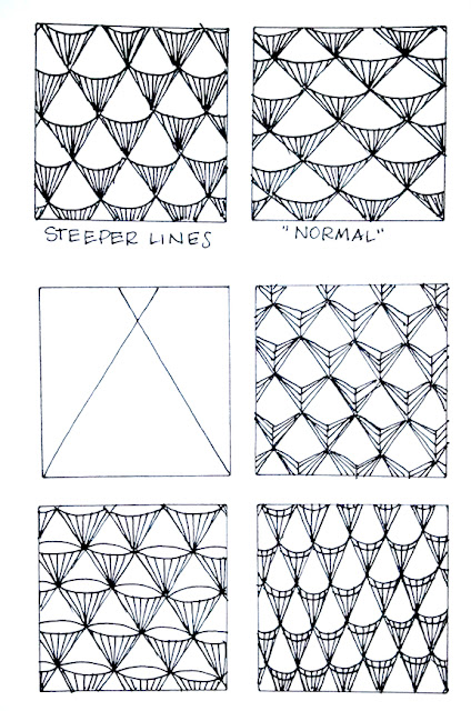
Just draw some parallel diagonal lines, and then do some going in the opposite direction. It doesn't have to be perfect. Perfect is boring. Shoot for halfway between perfect and interesting. 

Yeah, I wouldn't listen to me, either. 

Here's an old cookie decorating trick that will help you draw a decent grid: 

Decide how big a slant you want on your first set of diagonal lines and draw one right smack in the middle of the space you want to fill. Then do the same for the lines going in the opposite direction, so you have an X in the middle of your section (like the first square). You will find that it's easier to keep your lines roughly parallel and more equally spaced if you start in the middle and work outward than if you work from one side to the other. Cookies don't lie. At least mine didn't. I still think the store-bought variety are of questionable integrity.


Next, turn your tile 90 degrees and draw a nice swoopy line through each diamond. Make sure you go from one point to the next, drawing sloooowllllyyy. It seems to work better if you draw each 'swoop' individually and don't try to make it one long wavy line. 


Then draw a vertical line straight down from the center of each curved line, to the point directly below it. 


Here's some stuff you can do with it. Not only did I skip the shading, I'm pretty sure I just plumb forgot to keep drawing when it came to square #3. Sorry 'bout that.


Filling in the negative space in between gives this pattern some punch. This looks better with a slightly bigger grid so you get some white space in between your lines for contrast.


...and a few more variations...


Ha... look what I found in an old photo folder! See??


Sunday, April 15, 2012

CORKIN


I've been on a circle pattern kick lately. They're SO much fun to play with. Coming up with simple patterns and then working out piles of ways to make them ridiculously complicated is my new favorite thing.

Here's the bare-bones approach to Corkin. As with any good morning worth starting, you begin with a doughnut. I can't believe I'm saying this, but skip the sprinkles. For now.


Some things you should know about CORKIN:
1. Don't get it wet.
2. Don't expose it to bright light.
3. No matter how much it begs... never, ever feed it after midnight. 


...or it will turn into this.


And now, a word from our sponsor:

I opened my eyes
And looked up at the rain
And it dripped in my head
And flowed into my brain, 
And all that I hear as I lie in my bed
Is the slishity-slosh of the rain in my head.

I step very softly,
I walk very slow,
I can't do a handstand-
I might overflow,
So pardon the wild crazy thing I just said-
I'm just not the same since there's rain in my head.

-Shel Silverstein

Saturday, April 14, 2012

POOMA

This pattern is named after my furry beast of a cat. (His name is actually Puma, but 'POOMA' is how he spells his name when he signs the father's day card for Paul every year.) I have to say, for a cat with no opposable thumbs, he writes pretty well.

So... with no ado at all... here y'go. :o)


I really should stop being so lazy and scan pics instead of using my camera phone. 

But... no.


Here's the fun part: Variations!


Actually, THIS is the fun part:


Puma's goofy side.


... and his mysterious side.


He was eight months when I adopted him from the shelter (about the time these pics were taken). I thought they were mistaken, as he appeared to be a full-grown cat. Turns out I was mistaken. 
He's huge.

Anyway... happy weekend to you and yours. 


Friday, April 13, 2012

SNIRCLES


I've been playing with a new pattern. Meet SNIRCLES. 
Named so, because they are drawn in a snircular shape. Obviously.

This pattern requires a little bit of concentration. It's not difficult to draw, but you have to pay attention. Just remember north, south, east, east, north, west, south, north, west, east, west, and you'll be fine.

Just kidding.


Some ideas and variations I ran with while working through the steps.


Some tips for successful 'snircling':
For maximum zen, draw all of your outer circles at once. Then all of the auras (step 2), then all of the inner auras (step 3), then all the 'tails' (step 4). It's easier to keep track of which lines are going in what direction that way.

When drawing the initial circles, go slowly and make a complete circle every time. Don't stop your line because you bumped into another circle because they will look more misshapen that way. A little bit of overlap is ok.

If you curve your tails rather than keeping them straight, your spheres will look more dimensional, which can be further enhanced by shading later on.

Keep your snircles small, or they'll run rampant. Just like children, the bigger they are, the harder they are to wrangle. ;o) And there's nothing worse than an errant snircle!


As you can see, the direction they face can make a big difference in the way your full pattern looks.


 inward-facing


side-facing


random (only 50% zen, requires some decision-making while you draw)


same one, only stringier.


I know that non-representational art is the whole point of Zentangle... but if it wasn't, wouldn't these little tulips look cute tucked into a tangle?? I couldn't help myself. Let's blame the fourteen years I spent decorating cookies for a living.

The red pen is quickly becoming the bane of my blogosphere existence. I swear, I try to remember to use it, but by step two or three I forget and have to start all over. Or I draw the wrong step in the wrong color. It is BUSTING MY GROOVE. See the basic steps I drew up, at the beginning of this post? I hope you like them, 'cause it took three tries to get the right parts in the right colors!

My theme song for this next attempt will be a really catchy song by The Afters, appropriately titled 'Start Over'. ;o)

*seven index cards later*

Sooo... sorry about the lack of red ink here, but here are the steps for the fancy border. 


I love this one. How could you not, when it looks like a breakdancing caterpillar? There's so much room for variation with this pattern. Look at the difference in the two borders at the bottom, just from changing the direction of the snircles.


...and there's so much potential in the SHADING.


That's it for now... thanks for reading! As always, I'm open to suggestions for improving the process.